
Problem Space
One of Jooyum’s main services is data cleaning and analysis for distributors and pharmaceutical enterprises via distributors’ data integration (DDI) plugins. The DDI plugin Jooyum developed can automatically fetch consumption, sales, and stock data for specific products in the assigned time and generate reports and analyses which can be used by clients to track the status of product flow. However, asking each distributor to install the DDI plugin is not an easy task. In fact, it requires multiple rounds of communication internally in Jooyum and externally with clients and distributors.
I was given the task to improve the current situation and the problem statement would be:
Procedure Optimization Project
#Axure RP #Interaction Design
Summary:
During my coop term at Jooyum, a SaaS company that leads traditional pharmaceuticals enterprises’ transformation and upgrading towards mobile internet, I designed an upgrade in Admin Platform to increase work efficiency by adding work scheduling and reporting features for employees and data visualization for administrative staff. My design is estimated to increase efficiency by at least 50%.
To develop a solution to improve working and communication efficiency for DDI installment procedure through an upgrade in Admin platform.
Stakeholders:
Employees
Managers and Admin staff
Clients
My Role:
Interaction Designer
Timeline:
July 2021 - August 2021
Tools used:


Empathizing & Knowing Current Procedure:
I reviewed the orientation package for both departments and experienced the work as if I were the users, including making phone calls for reservations, validating data, and managing schedules for team members. In the process of putting myself in users’ shoes, I found myself doing lots of repetitive work.

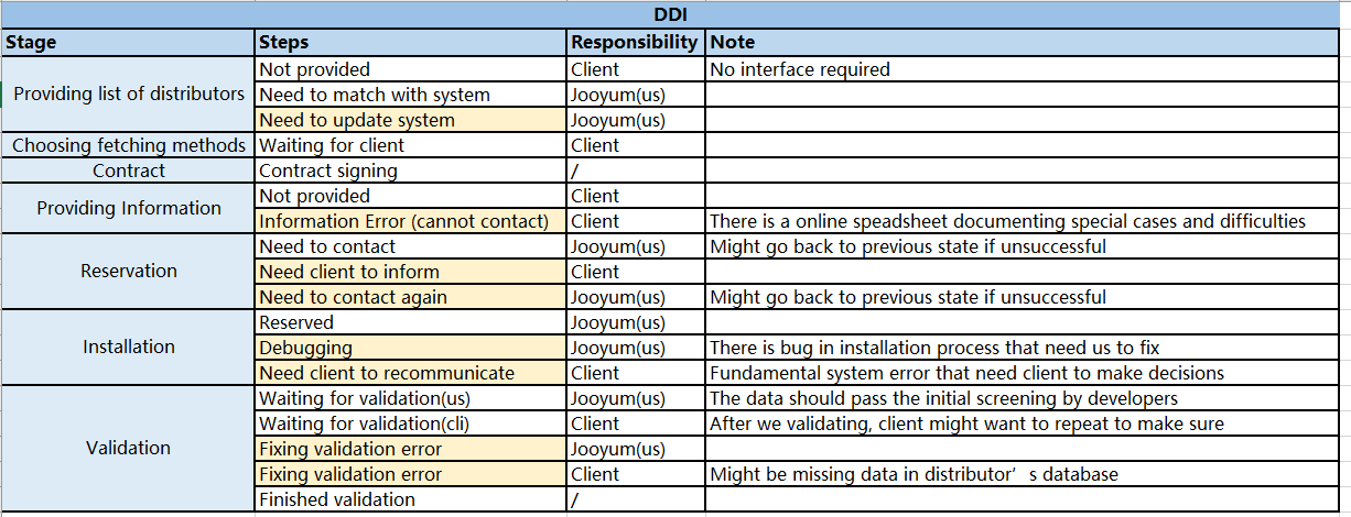
Furthermore, I was able to put down my experience into a flow chart.
This marks the overview of the current procedure in which lots of steps are standard and unavoidable.
After trying out work from different departments, I found out that although the amount of total information is overwhelming, for each stakeholder, the parts in the procedure that matters are different and relatively smaller, compared to the big image.
My goal is to design a platform for different stakeholders to help make this procedure more relevant and simple based on their position.

One of the most painful experiences would be dealing with massive spreadsheets which probably only one column matters to me. And everyone was editing it to update their work which makes the sheet really messy and long. Furthermore, I needed to search every time when I finished contacting a distributor because it is organized by clients’ internal code system.
The image is a recreation of the spreadsheet due to NDA.
Research via interviewing:
I validated my assumptions and feelings with 15+ fellow employees and gathered some main pain points:
Requires manually updating online spreadsheets, reporting progress to multiple people, and repetitively checking a rapidly changing schedule.
The current task assigning process causes Discrepancies in workload between members, which would cause overtime working for some people and little work for others due to the nature of the job.
I also set priorities based on the importance of each step and amount of repetitive work, trying to ship a beta version that can get people used to working in the admin platform and actually reduce workload internally first.
list of pain points
New User Flow:
I started making a new flow chart for the new procedure which got optimized after collecting all the pain points. I took another opportunity to present my plan to managers of two departments and received constructive feedback. I was able to make an updated flow chart that outlines the information flow between roles and stages as shown in the diagram below.
For example, internal data team members (third role), come into play after all the contract has been signed. Their main job would be to contact the distributors via phone calls and validate information and data. Hence, if we put these three main features with corresponding information into the admin platform, data team members would be able to perform their job instead of looking into a massive spreadsheet for information that they don’t need.
As you might see on the left, I broke the space into five rows, each indicating one type of stakeholder, including clients, distributors, internal data team, internal dev team, and managers.
By separating into roles, the overall flow becomes clearer. More importantly, we can clearly see when each stakeholder comes into play and what features each stakeholder needs to play their roles in this procedure.

Features:
Based on the chart, I made a low fidelity interaction design draft using Axure RP. The design consists of basic main functions and interaction logic in specific scenarios. For example, the picture below shows the interface the reservation employees (internal data team) would see when they work.
The picture is the list of work tasks assigned. Using a table display, the employee would visually see his weekly workload and their status. Instead of giving team members a spreadsheet of every day’s workload, managers will label the work load on their ends and the work would automatically be populated to team members’ table. Team members can use the CTA on the right to go to the info page.

This is the information display session for each distributor. This would include the basic information needed to complete the reservation process, like phone number and contact name.
There would be pop-ups for employees to use to report their daily work. After they completed the questionnaire, the status would be updated on both clients’ interfaces and managers’ admin platform. This would massively reduce the communication effort between three roles which would reduce overtime working for redundant reporting.
Similar approach is repeated with all other stakeholders and similar design is carried out in almost same logic.
Overall result:
Following this process, I repeated all the blocks for each stakeholder. The final result is a screen flow diagram.
Due to sizing issues, the picture below is a snapshot of the whole product.

Feedback:
Unfortunately, the system is not able to be developed by the time I left Jooyum due to scope of the project and time constraints.
However, I have received multiple positive comments from staffs about their confidence in the project that would increase efficiency by at least 50% because the system would ideally eliminate the spreadsheet usage.
Takeaways:
The largest takeaway would be methods and hands on experience in the field of interaction design. Engaging in projects this big is unusual in China as an intern; therefore, I took full advantage of the resources the company can offer. General manager, Xiaoshun Wang and supervisors, Jingjing Xu and Yu Huang gave me massive support in interaction design standards and logic, providing me insights from a more experienced point of view. Now I can see apps and softwares are not as simple as what is shown to myself, but also thousands of restrictions and logic which ends up as code to regulate user behavior in forms of error messages.